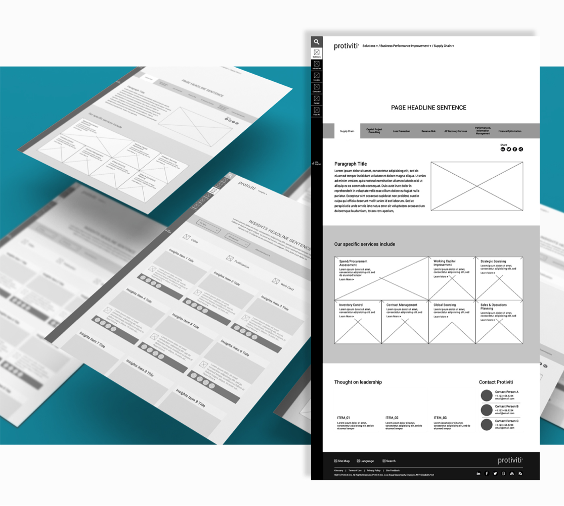
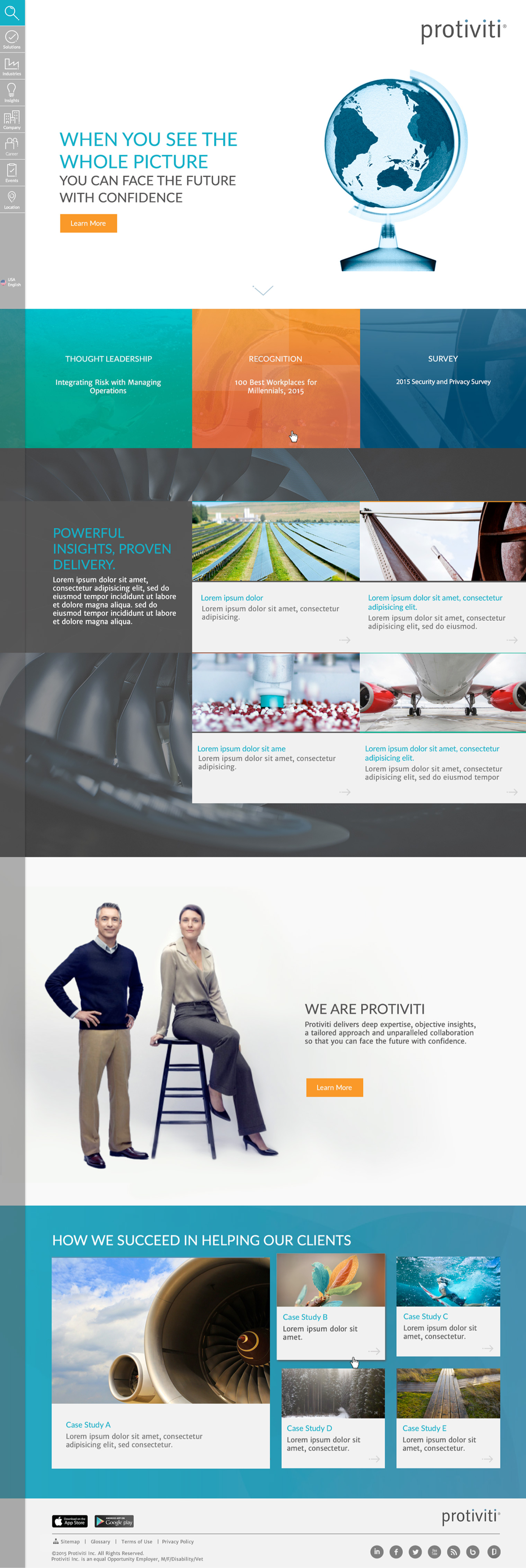
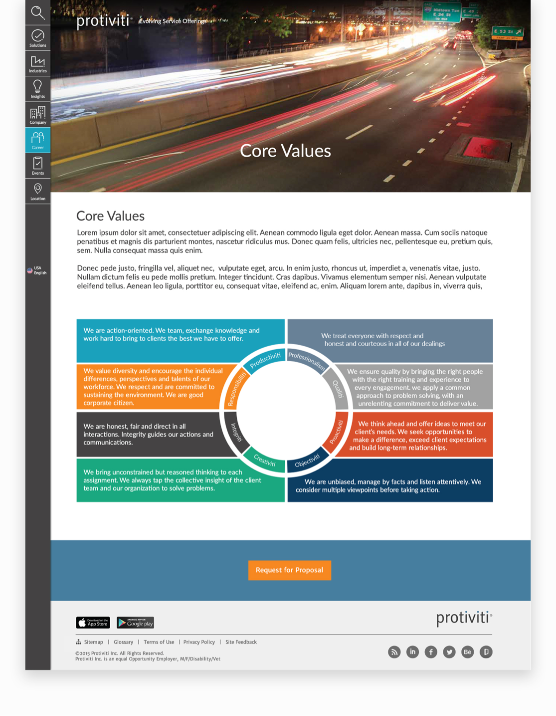
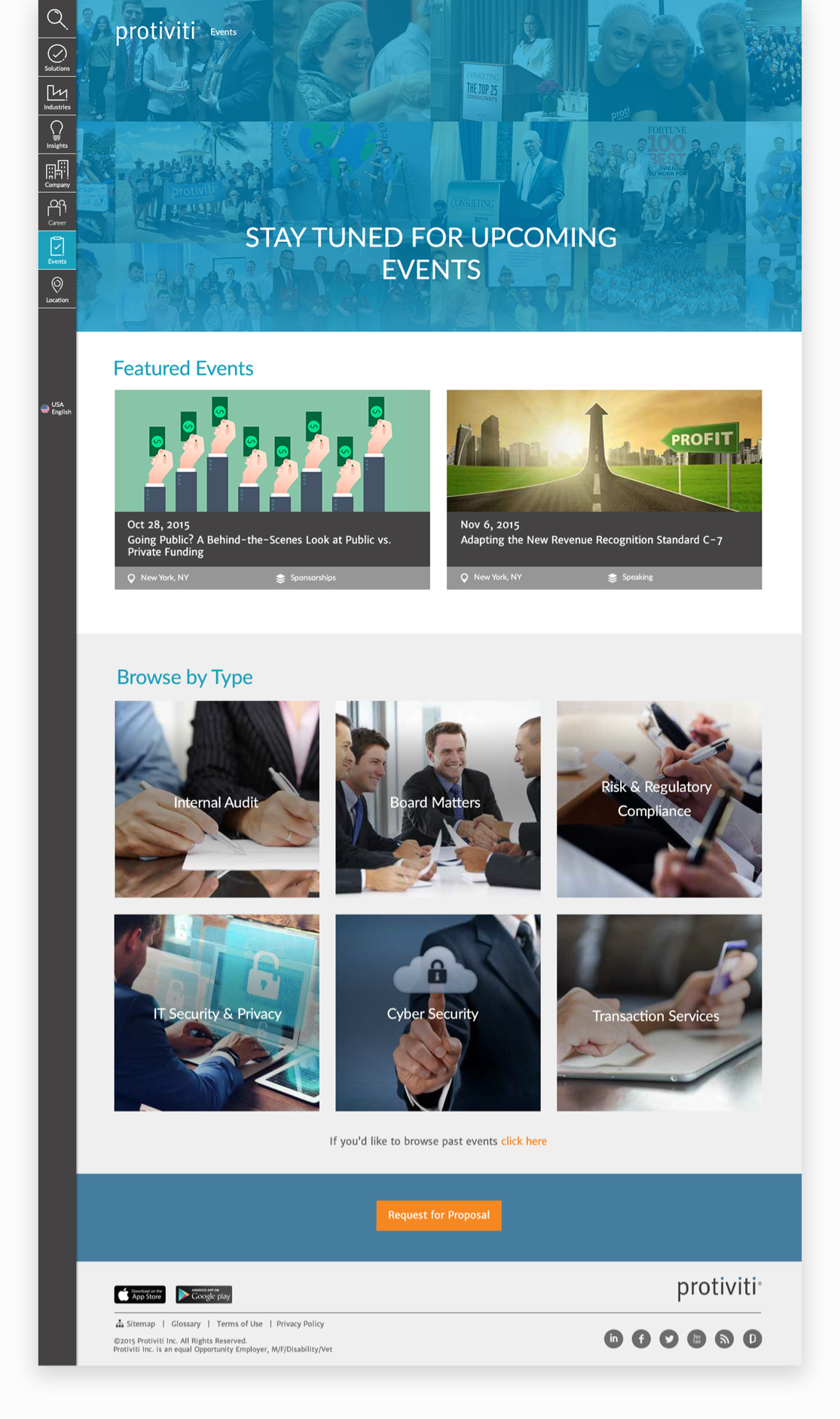
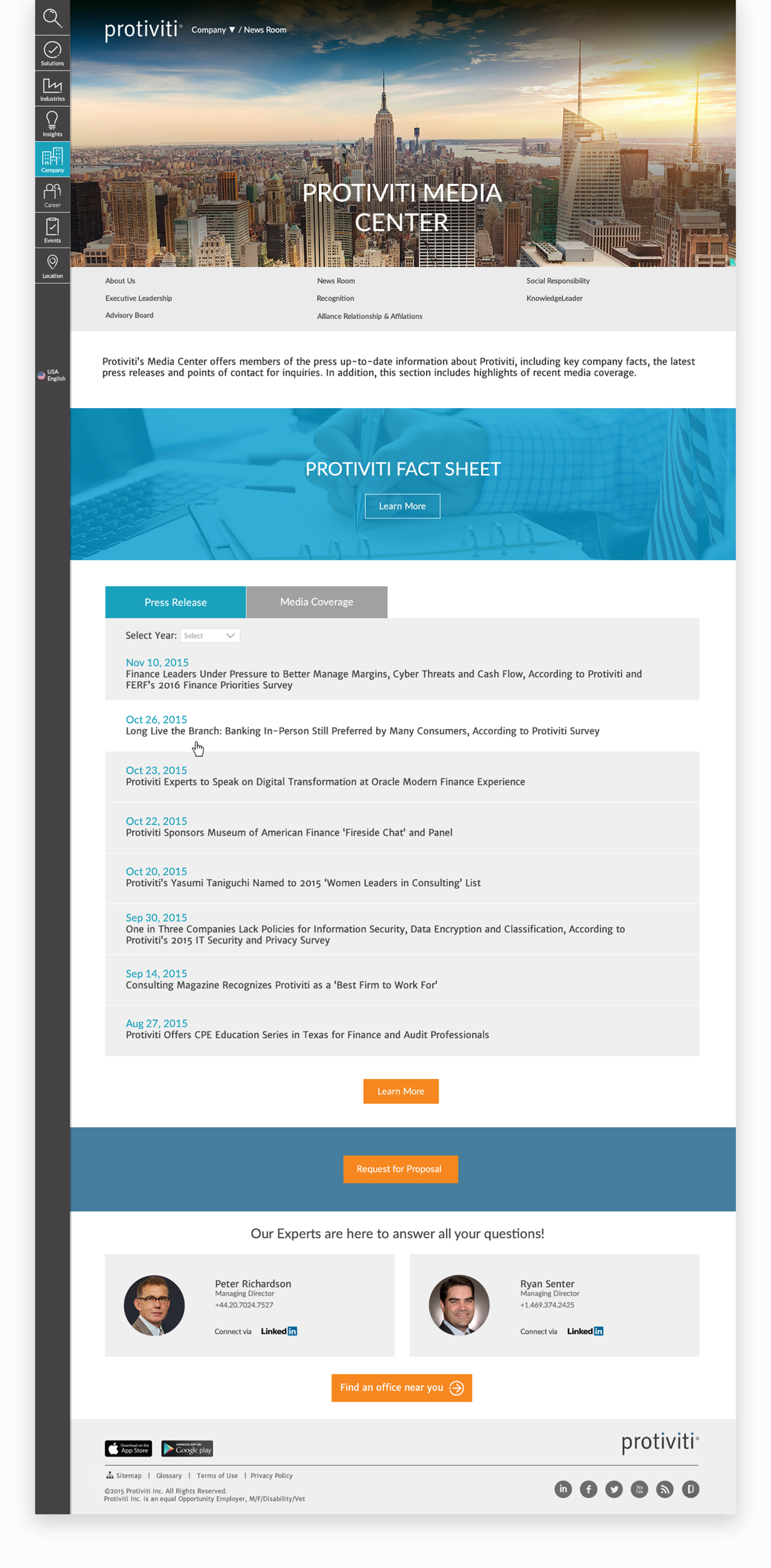
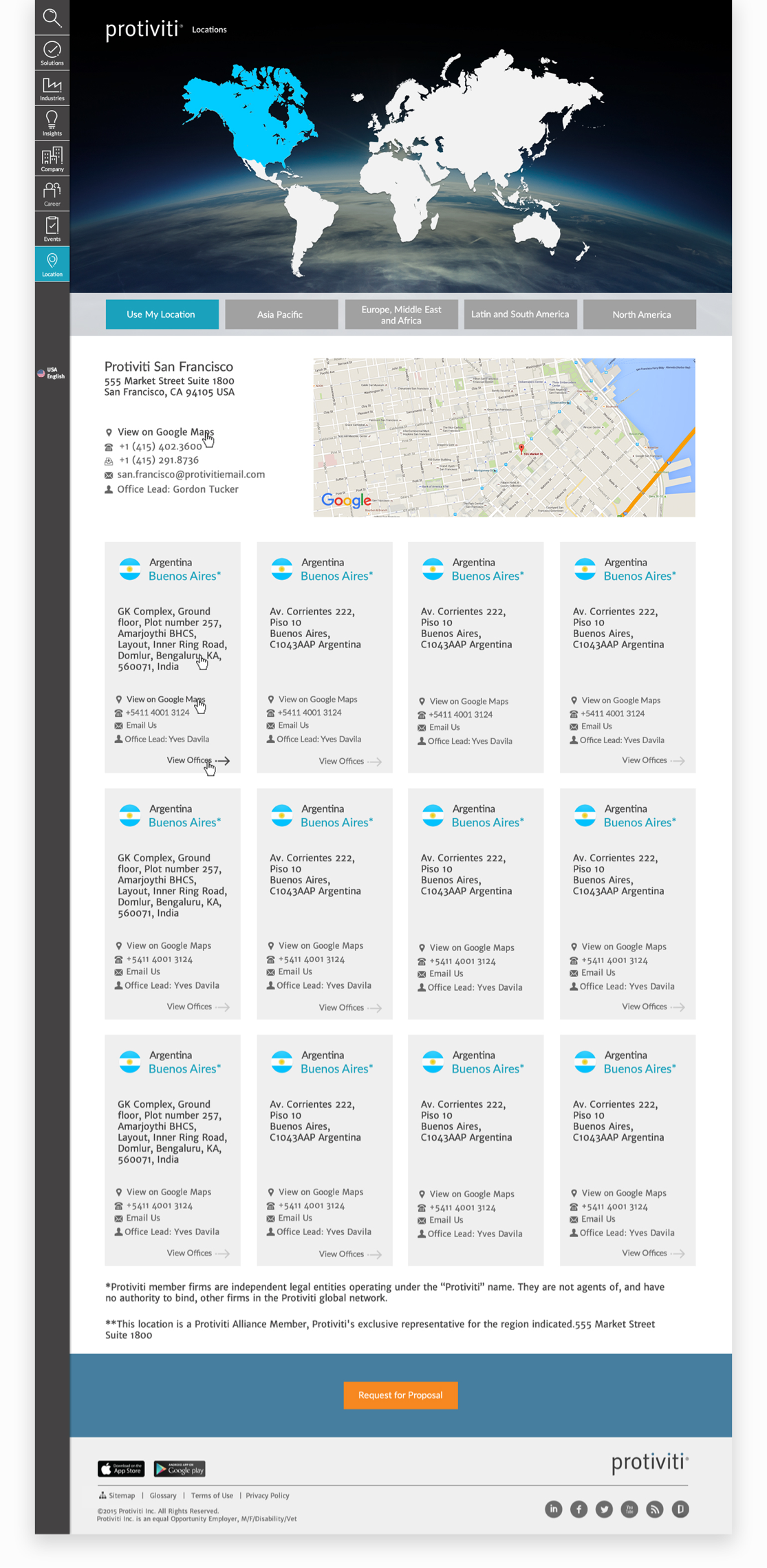
"Being the engine that drives each website, navigation should be predictable, simple, consistent, and well-placed.
I opted for a left-hand side navigation design to avoid cluttering a horizontal bar with excessive text and options. This approach also provides more horizontal space for organizing navigation subcategories. For example, Protiviti has 8 navigation tabs, some of which contain up to 12 sub-navigation items, including sub-navigations with their own sub-navigation layers.
The choice of a left-hand side menu was influenced by the fact that it is easier for users to track and read large navigation menus. This is because we are accustomed to reading from left to right by default. When a user clicks on a category, the menu expands to reveal sub-options. Additionally, this layout offers more space to maintain a clean page design and emphasize the main message on the homepage.
In contrast, a horizontal navigation bar may work well when dealing with long content, as it allows users to scroll and easily click through the options."


