Front

Front Financial is an investing app powered by real investors and smart technology. It helps users to connect their brokerage accounts, get free portfolio scores, analyses, and get inspired by the community's points of view concerning investments.

01

Abstract

Added a feature to the app in order to organize content and provide clarity on the content available on the Home feed.

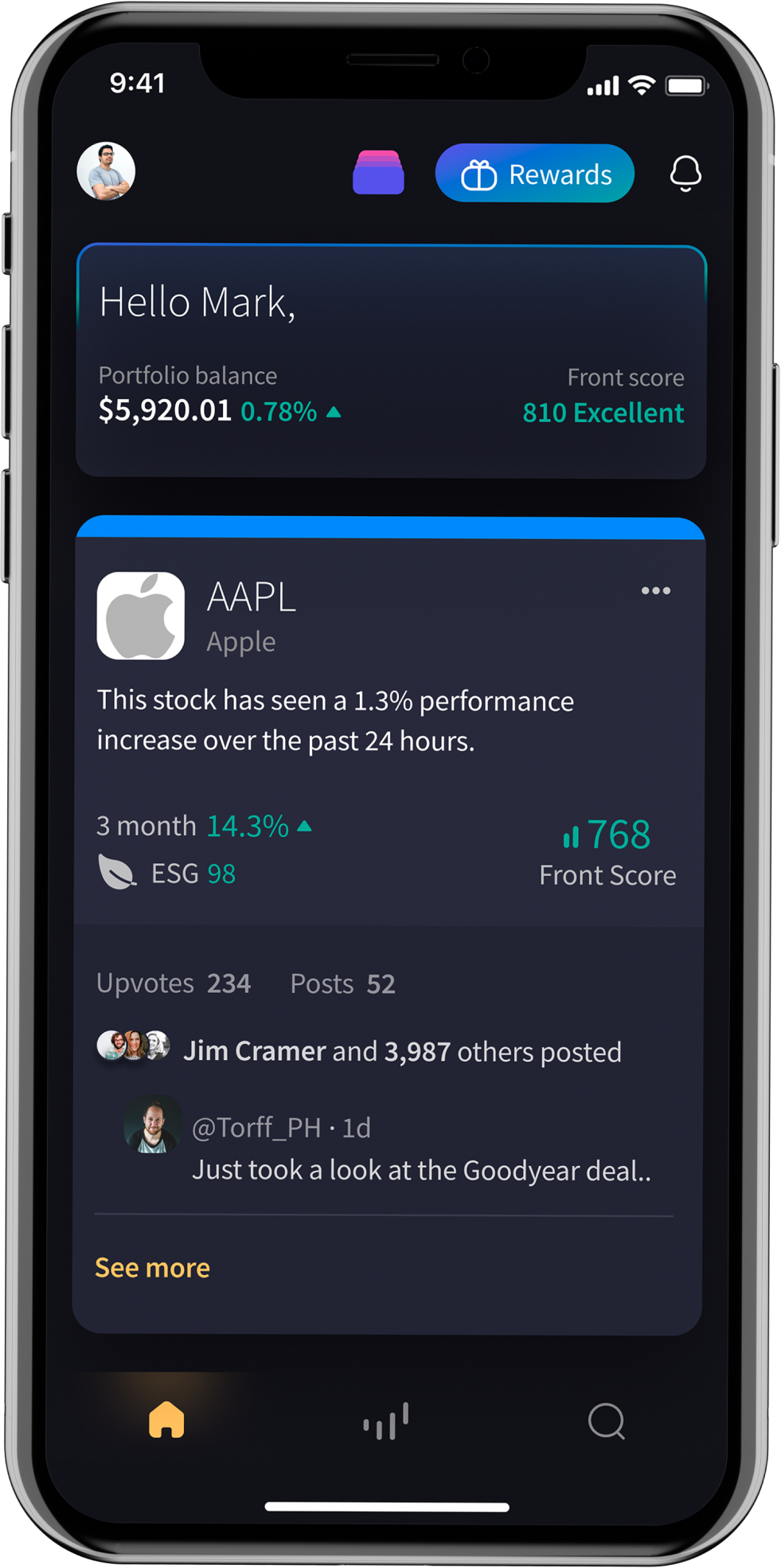
The recommendation cards are designed to help users understand the best-performing assets and get an overview of what people are saying about them in one place.
image of a person trying the app with plants

My individual contribution

In my capacity as the Head of UX, I actively oversaw all facets of the project, delving into data, feedback, and user testing results. The identification of a user task issue on our home feed prompted me to personally spearhead the project.

I played a hands-on and integral role in shaping the project's design direction. Collaborating directly with the team, I engaged in problem discovery and ideation, personally steering the UX process from its inception to the creation of high-fidelity wireframes.

My involvement extended beyond the conceptual phase, as I worked closely with the CEO, marketing, and development teams at various levels. This hands-on approach ensured that the project not only reached its full potential but also meticulously adhered to constraints throughout its development.
Process

image of a person trying the app with plants

Tools

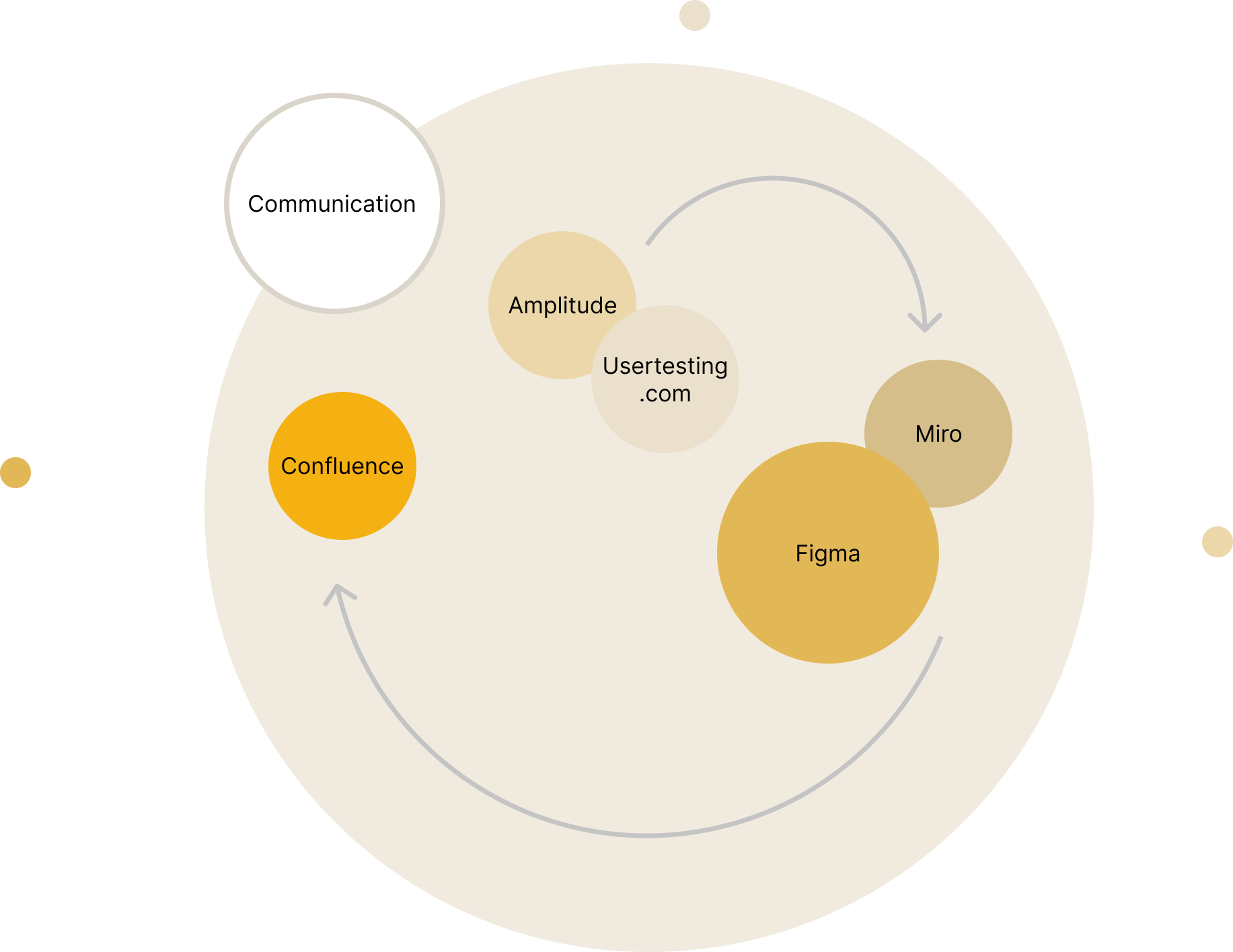
The following is a visual representation of the tools used in this project.
Communication, Amplitude, usertesting.com, Figma, Miro, Confluence

Current Homefeed

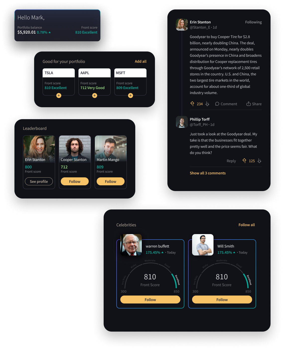
The homefeed includes portfolio over view, social media generated posts, a highlight of the top performing portfolios, a highlight of the Celebrities profile, and Stock recommendations.
homefeed components

Research

Research summary

A comprehensive overview of analytics, user testing results, and observations reveals insights into two key groups: individuals interested in investments but lacking stock market knowledge, and those seeking analyzed information on the current home feed.

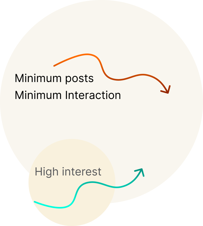
  • Minimum posts:
    Almost no one created new posts.

  • Minimum interaction:
    Fewer than 5 percent of users clicked on posts.

Based on our data analysis and user testing, we found that the home feed content doesn't have the expected interaction. In spite of this, the users on our user testing found both, the concept and content attractive and useful, however, observing their actual behavior and the data, we found that there is very little engagement with the home feed.
visual presentation of the research summary diagram

It's for who

We have three types of users, and this case study addresses the needs of all three.
audience icon
A person who is not categoized as expert in the investment world
audience icon
An experienced investor who is interestead in summerized info about the assets
audience icon
An expert investor who is here to evaluate the information.

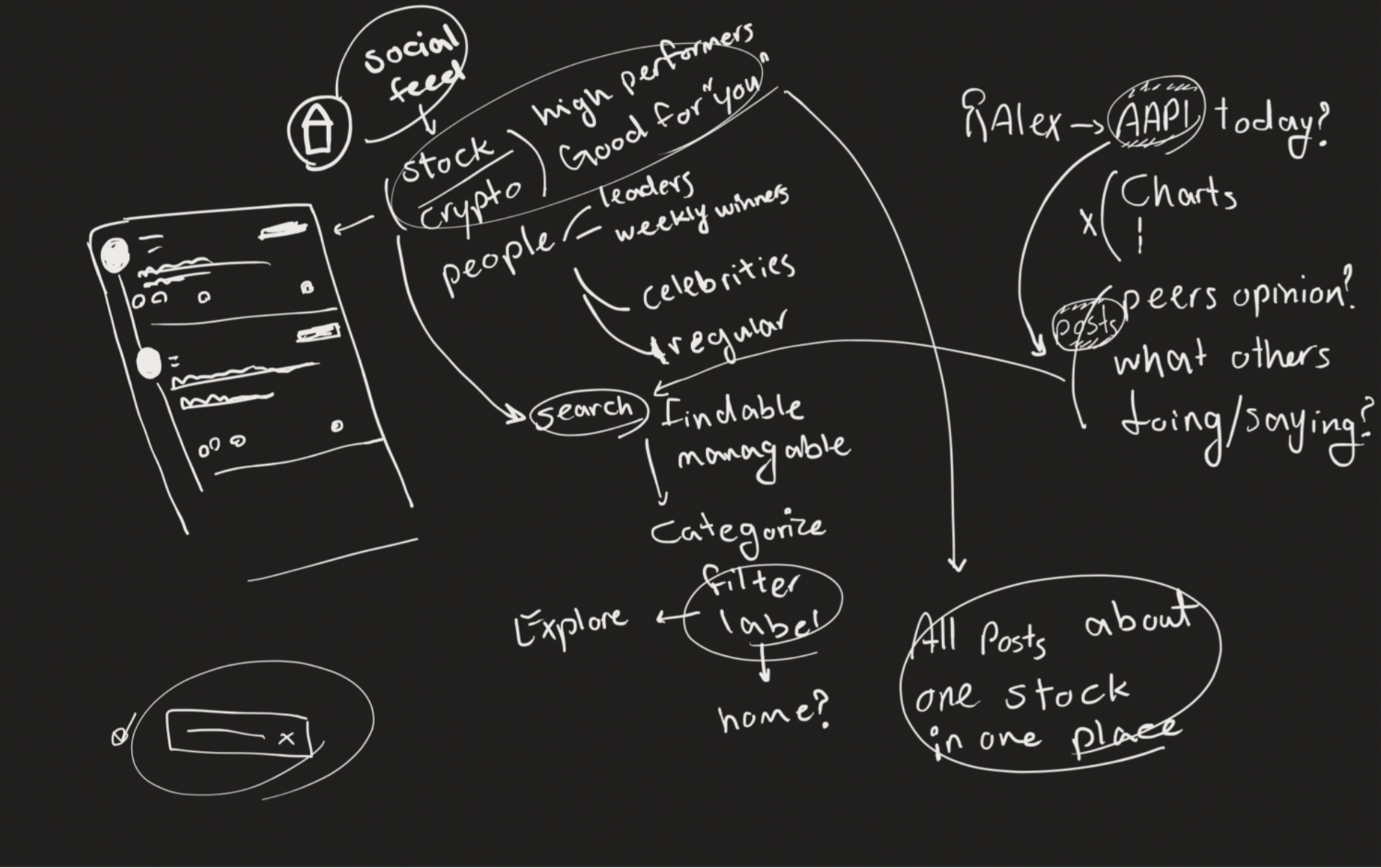
Affinity diagram - Social section

Affinity diagram

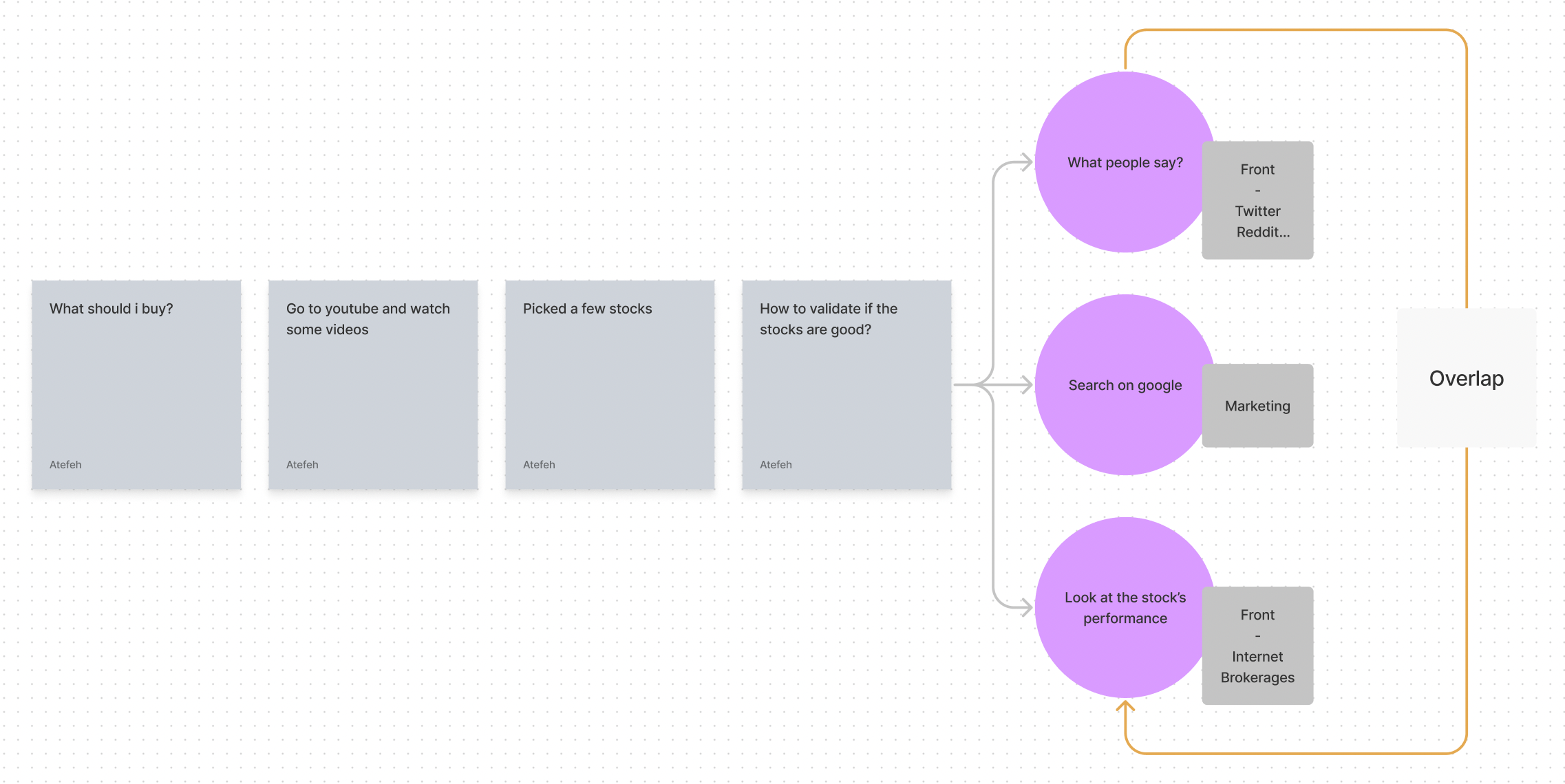
User Journey

image of the user journey

Current Problems

Based on the observations and experiments, we have consolidated the current problems into three main points.
apps icon
An unorganized collection of information
question icon
Lack of guidance
lock icon
Lack of incentives

Ideation

Proposed Solutions

In response to the above problems, our proposed solutions were.
all apps icon
Categorize the user-generated posts
communication icon
Add Onboarding and in app guidance
knowledge icon
Ideate on creating incentives

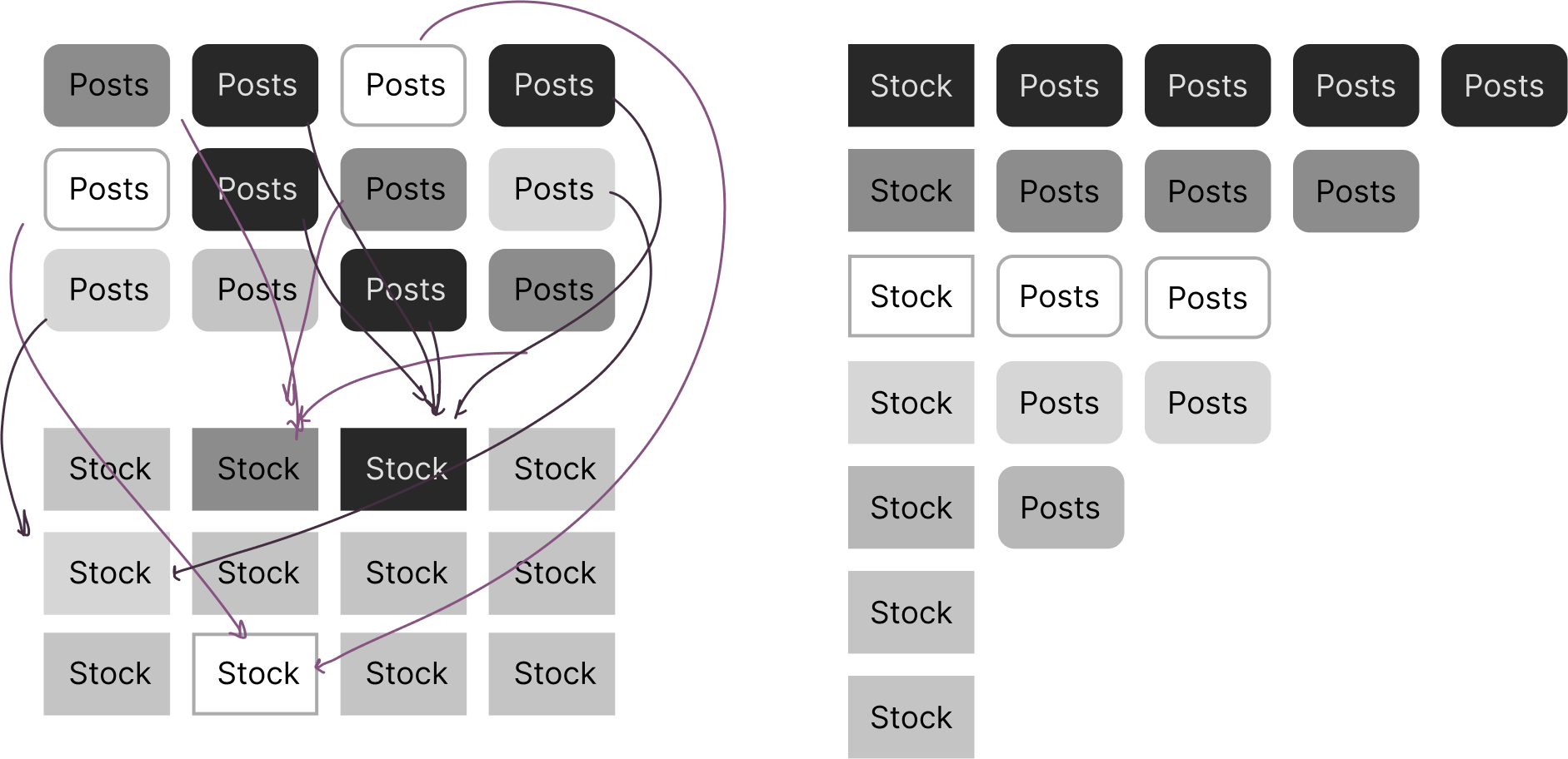
Illustration of the problem

An unorganized collection of information
Affinity diagram

Brainstorming

Affinity diagram

Mid-fidelity wireframes - Recommendation cards.

Based on the main needs identified through studying the journey map, we have created recommendation cards to replace the asset recommendations on the home feed. This is aimed at providing users with access to the complete package of information about the asset, encompassing both social media posts and the asset's most important details.

Mid-fidelity wireframes - Asset detail page.

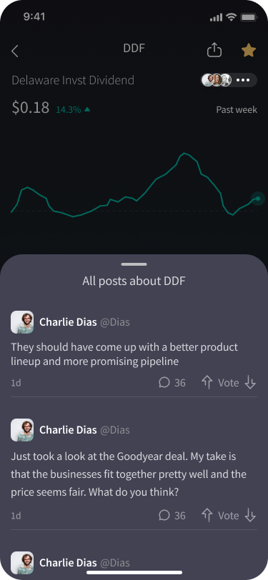
Consolidated the social posts on the Asset's detail page to increase accessibility and findability.

High-Fidelity Prototypes

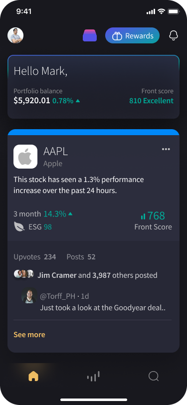
Presented the high performing assets in a categorized format:

Having considered both the needs for asset research as well as reading people's opinions, I came up with the idea of creating cards on the homepage to highlight the best performing assets.
image of the user journey

The needed data is consolidated on one screen for easy access:

By providing all necessary information onto a single screen, I created a user-friendly interface that empowers decision-making..
image of the user journey

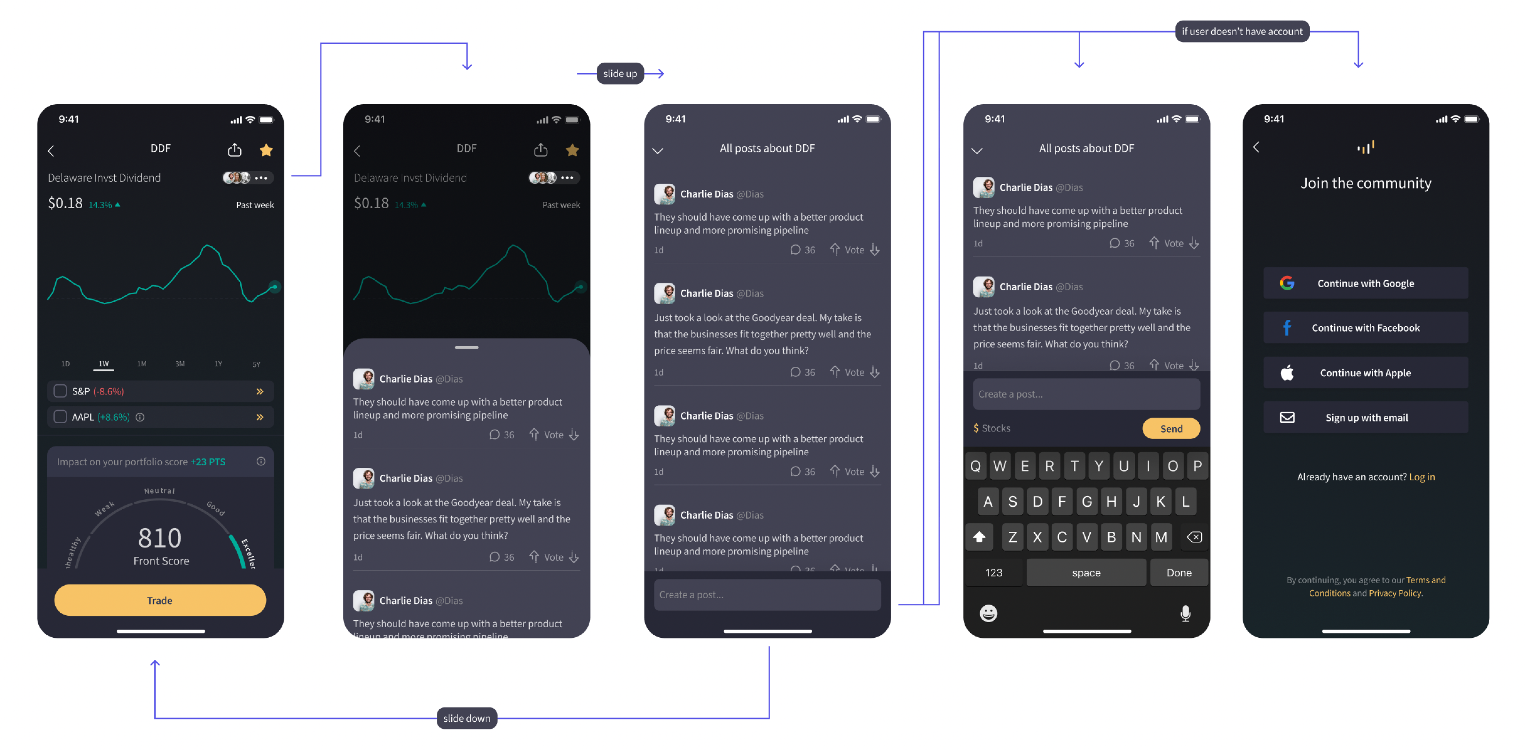
Flow and Structure

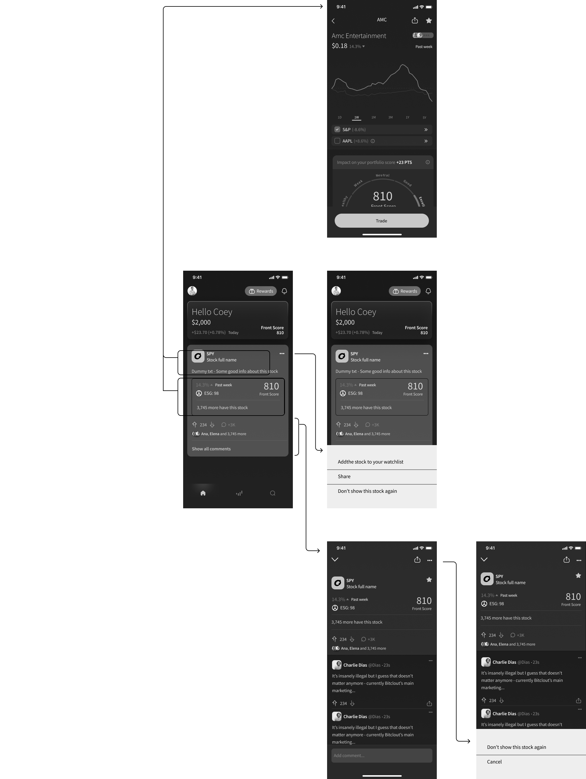
Asset's page flow

image of the user journey

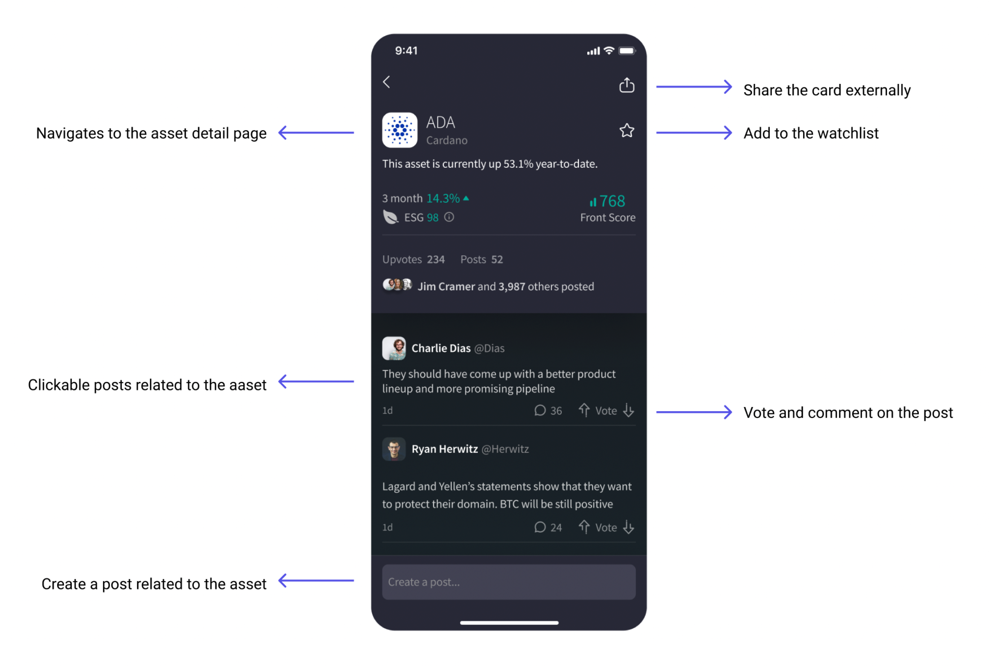
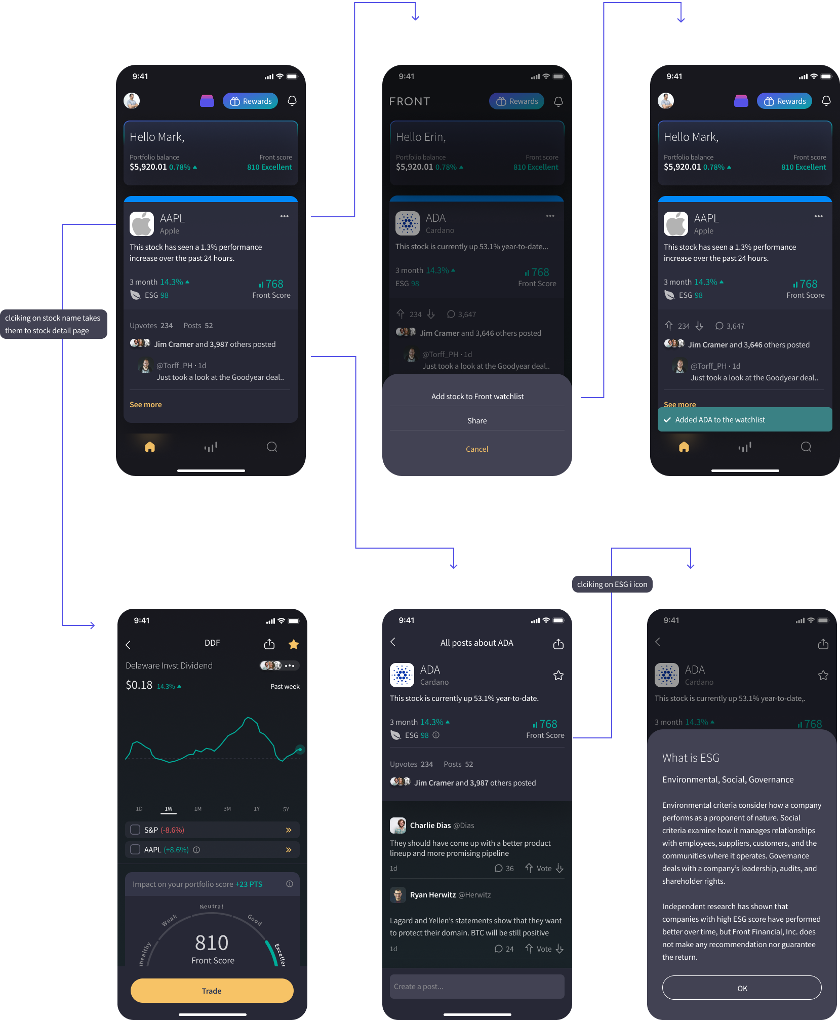
Card detail page:

In the screenshot, you can see the notes indicating the sections' navigation direction and detonation

Summary of the task

a.

Add the stock to your watchlist
Share the card
Hide the asset


b.

View the asset details


c.

View card details


image of the user journey

Outcome

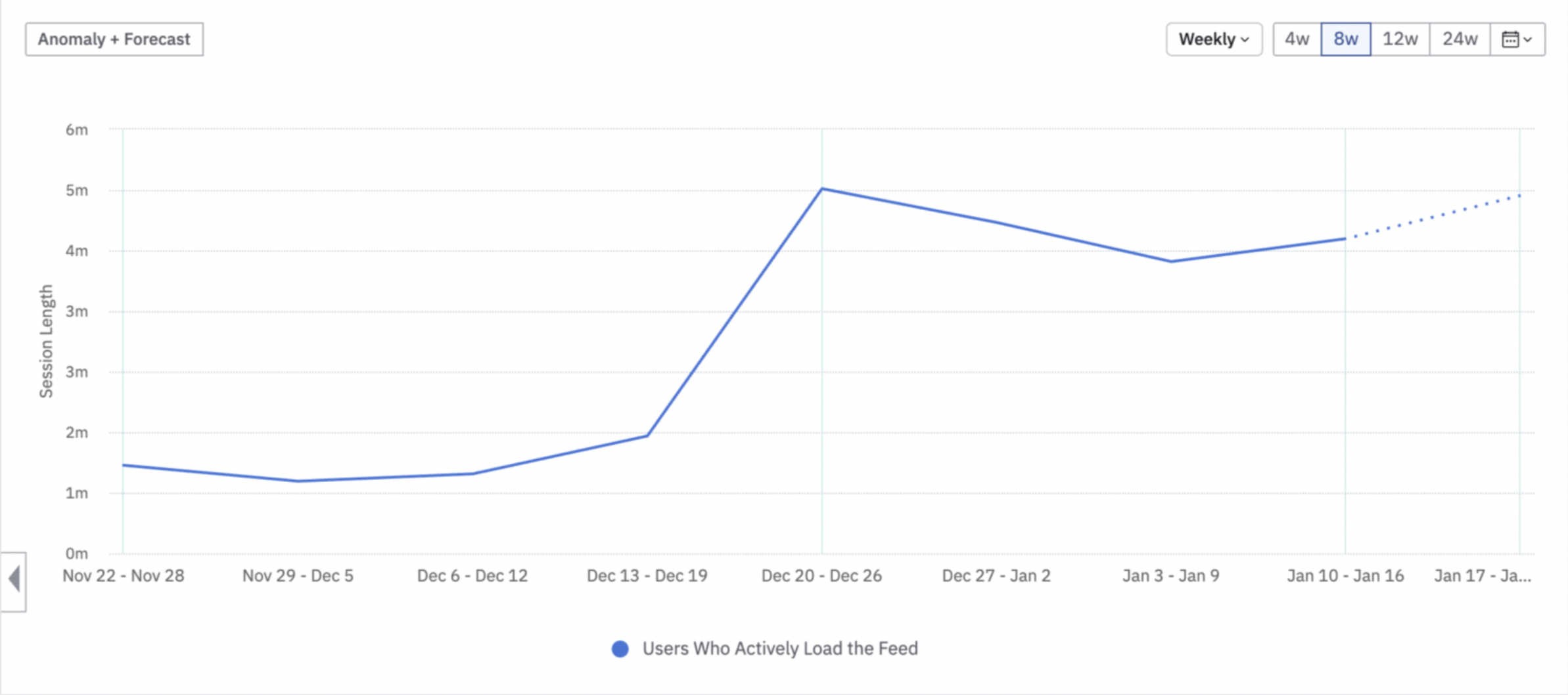
We monitored the data for two weeks and found that the average time spent on the app has gone from 2 minutes to 4 - 5 minutes since the cards have been deployed.


User testing

Research Intention

  • To understand users' attitudes and opinions about the new feature: Recommendation Cards on the home feed

  • To get an idea of how easily users can find and make use of this new feature

  • To discover and understand any issues with the home feed and its features

Target

  • Gen Z

  • Millennials

  • Gen X

Operation System:

iOS and Android

Number of Participants:

12 total participants. 6 iOS and 6 Android

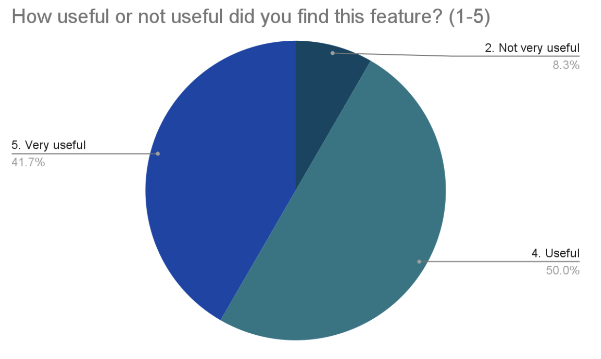
User Testing Result